Sunday, April 18, 2010

portfolio ads


Bad odors print ad
Gold Bond
People who suffer from smelling feet.
Gold Bond removes the smell.


Finger painting mom print ad
Hamburger Helper
Busy Moms
Hamburger helper gives mom free time


Swinging Mom print ad
Hamburger Helper
Busy Moms
Hamburger helper gives mom free time


Tax day versus anniversary print ad
Hallmark
Working Adults
Hallmark makes your life easier.


Monday, April 5, 2010

radio post

http://adsoftheworld.com/media/radio/sprite_zero_history_eraser

Sunday, March 28, 2010

travel and tourism ads

This advertisement is unique because of its ability to tie in a common past time for Canada with a commonly used service.  With its simple image, Fedex is able to convey its loyalty to Canada and that it is a company that knows its consumers.


This outdoor advertisement creatively uses the space around the actual advertisement, which draws the attention of the consumer.  It shows the ability for anyone to go on  a trip without even thinking about other responsibilities and that this company is able to make trips happen quickly.


This airline advertisement conveys its ability to make anyone's dream a reality.  It's creative execution is simple, but unexpected and therefore is able to be effective.


Monday, March 8, 2010

long copy ads


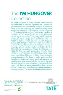
These headlines draw in the attention of the viewer.  From an art gallery to ramen noodles, advertisers effectively have used copy to humor and educate the reader.  The copy exemplifies the attitude of the product it advertises in a manner that has the consumer needing to finish the advertisement as opposed to flipping over the page.


Though I am not sure, if this Honda advertisement constitutes long copy because of its length, it uses a different technique to grab attention.  As opposed to using a witty headline, it instead uses the shape of the text to be different.  In all advertisement, whether it may be the copy or the image, something needs to lead the viewer to it.  In this case, it is because of the banana that the reader is still inclined to read the copy.

Sunday, February 28, 2010

outdoor ads

This Law and Order advertisement uses the typical outdoor placement, but uses the space creatively.  There are recently been a lot more outdoor advertisements that go outside of the traditional rectangle of billboard space.  This however, uses light in an interesting way to capture the man's face while also showing the main focus of the television show.


Mercedes has also used space to show the features of their new car.  Similarly to the Law and Order advertisement, they both go outside of the boundaries to attract attention.  The creative production of the advertisement stands for itself so the copy is simple.


The creativity of placement with this advertisement is hilarious.  Though it is a little bit disgusting, nose hair trimming is not the most clean topic to discuss.  They are able to place the advertisement in a location that is truly unique and it completely wows and shocks the audience, while sending its message directly.

Sunday, February 21, 2010

ad campaign


I have always loved the Absolute Vodka's advertising campaign.  Because they made their advertisements collectables, I remember I bought my sister an Absolute Vodka book that had all of their advertising.  Even today, they keep coming out with new advertisements that still go along with their campaign.  It is very rare to see an ad campaign span so many years (since 1981).  They just came out with an Absolute Boston advertisement that I love because I am from Boston.  Absolute Vodka is able to address many different individuals with their versatile campaign.

shadow post

I've been looking into shadow advertising for Keurig.  This is what I randomly found online and wanted to share.

Wednesday, February 10, 2010

verbal solutions

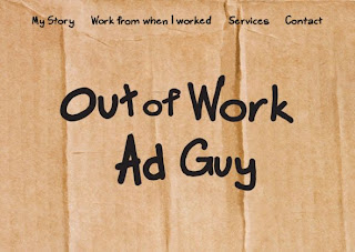
The humor behind this advertisement is unique as the viewer has a chance to see from the perspective of the person working in advertising. As advertisers are usually thought to be untrustworthy, this brings a sense of human characteristic to the advertisement. It also allows the audience to have a personal connection with the advertisement and all of this through just the use of copy.
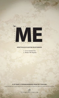


This marriage counseling advertisement uses the 180 method. It's simple directions show how me and be turned into we. The use of the dotted line demonstrates a level of interaction between viewer and the agency that created the advertisement. It does a good job of being clear cut and creative while only using text.



With the use of only copy, this advertisement gets across it's client's message in an effective way. it shows the wide variety of responses and emotions that a child could be feeling while bringing in a call to action. The usage of black and white space is unique as it spells out "help."

Saturday, February 6, 2010

visual tactic

This advertisement makes the audience take a double take to see what the glove is actually holding onto.  The image conveys the strength of the grip in an unorthodox way.  Furthermore, because it is impossibility for the glove to actually go through glass, it makes the advertisement more intriguing and eye catching.


In a society that is becoming more environmentally friendly, advertisements that promote this mentality are popular.  This advertisement that promotes fuel efficiency is unique as the picture says the entire point.  The difference in size of the fuel jugs advertises "smart" without any words.


The advertisement promoting seatbelt safety, is one that uses a visual tactic without having any copy.  It clearly shows the message that is trying to be conveyed by the "Verkehrs Wacht" in a direct manner.


Friday, January 29, 2010

3 ads with creative tactics

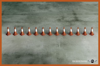
The mini cooper advertisement uses the "without words" creative tactic as the image speaks for itself.  The line of cones represents the size of the mini cooper and its ease of being able to maneuver in between those small spaces in contrast to the other cars.  With so much clutter and overuse of copy, this is an advertisement that stops readers with its ability to address the message without overwhelming the audience.


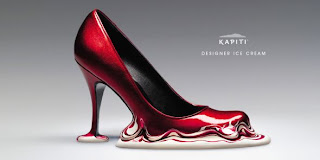
The element of surprise is used because it this looks like a shoe advertisement.  However, it is an ice cream advertisement that uses the "change the product" creative tactic.  The title "designer" relates to the quality of the ice cream.  As the shoe melts right into the ice cream it seemingly represents that they are a cohesive whole similar to them both being designer products. 

This advertisement for a farmer's market combines a paradoxical situation with an exaggerated creative tactic.  It uses fuzzy warmers that represent winter to prove it's point that their tomatoes are available all winter.  The situation is exaggerated through its usage of two completely unrelated objects, tomatoes and warmers.  It is simple in its copy and image, but the slight intriguing aspect of the combination brings the reader to reevaluate the advertisement as opposed to flipping by.


Wednesday, January 27, 2010

blogging begins

first post :) excited to begin this journey